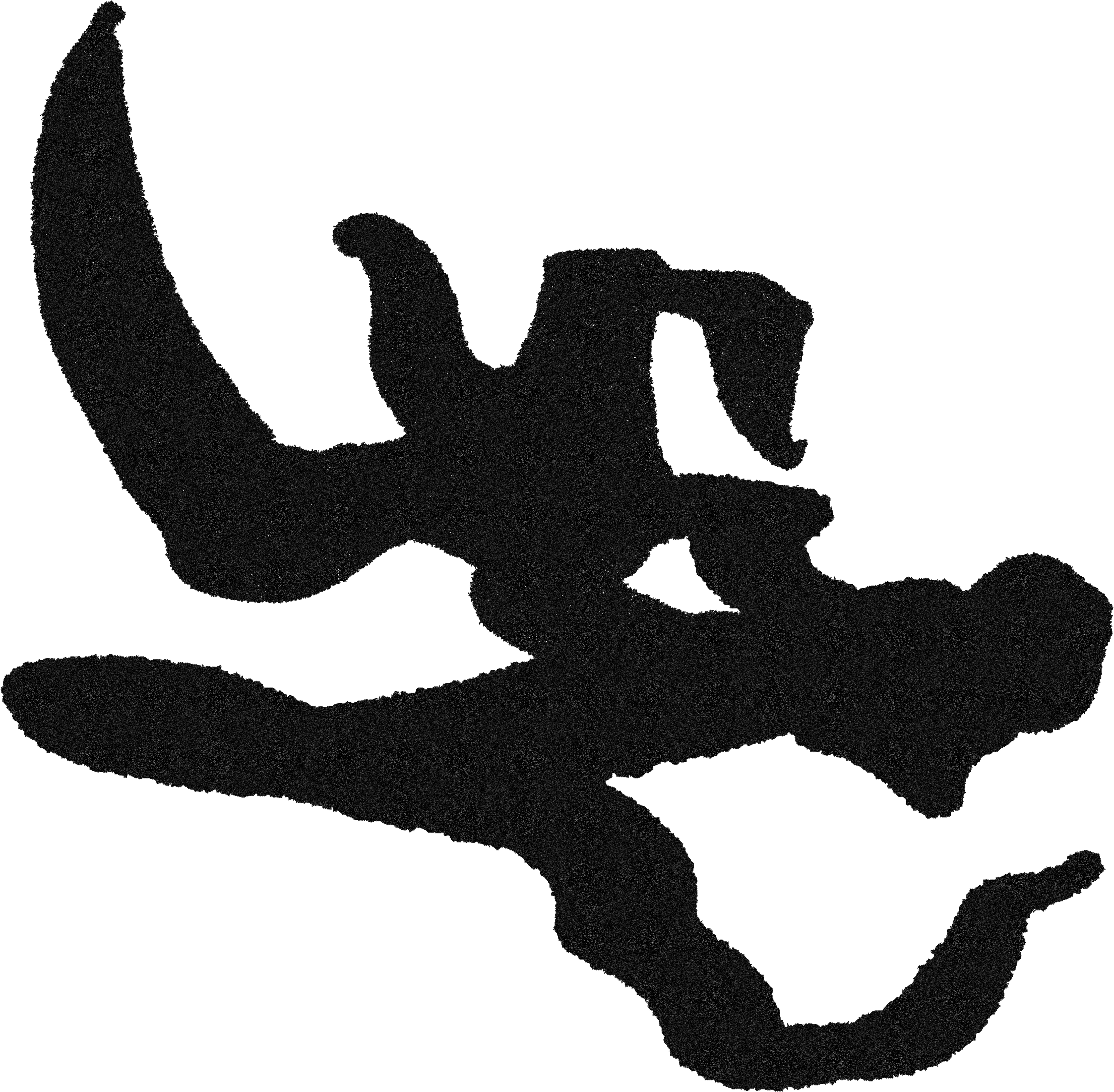
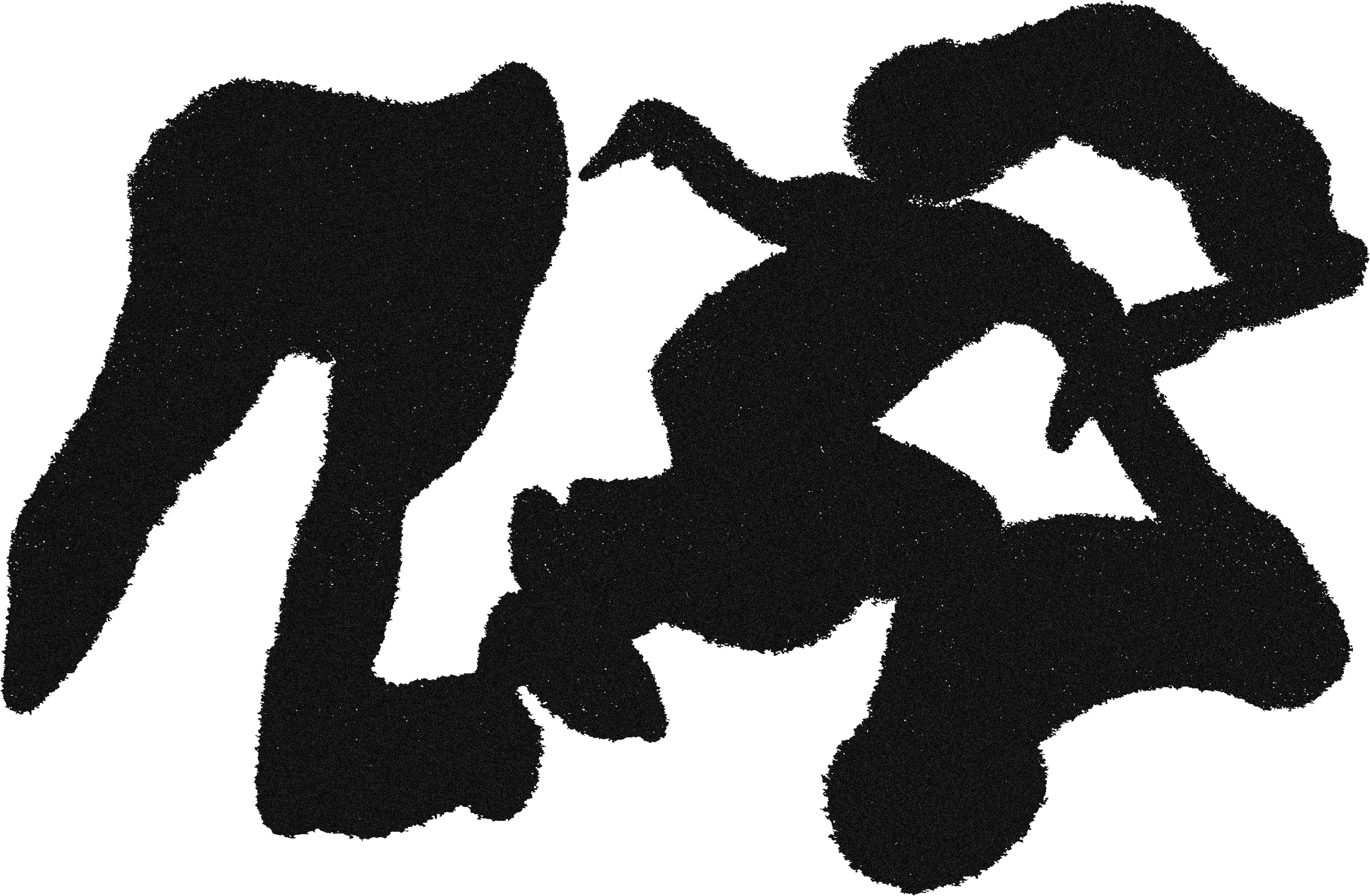
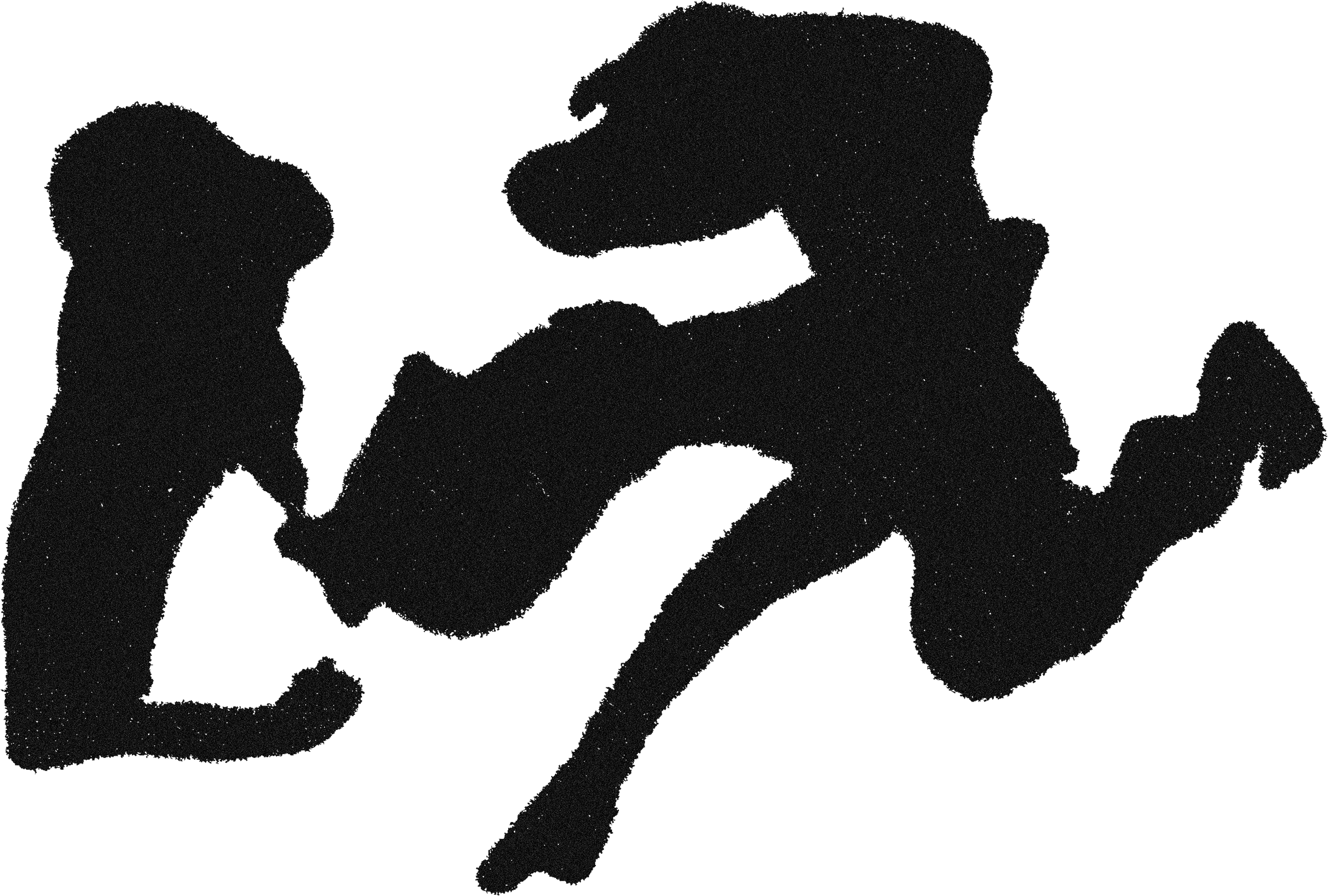
The creation of this typeface emerged from the experimentation with ferrofluid. By moving the magnet underneath the surface, I allowed for the ferrofluid to follow the natural curvatures and fluctuations of the magnetic field and to, therefore, path its own way across the paper. As the fluid skims the surface, it is quickly absorbed within the grains of the paper, leaving a fuzzy trace along its way. Its path is also defined by the orientation of the magnet. When held perpendicularly to the paper, the ferrofluid will be attracted to the entire circumference (or perimeter) of the magnet, leaving a larger footprint. When the magnet is held at an angle however, the ferrofluid will be attracted only to the section of the magnet which is closest to the surface. This allows for more control over the overall look. What emerges, however, is mostly determined by the unpredictable behaviour of the ferrofluid.


The origin of ferrofluid dates back to the early 1960s and it was created by NASA engineer Steve Papell. It consists of tiny magnetite particles (in the order of nanometres) suspended in a carrier fluid, usually composed by mostly oil-based liquids. The viscosity of the carrier fluid allows for the magnetite filaments to follow magnetic fields without them clustering. Originally the liquid was designed as magnetic fuel for spacecrafts, in order to be drawn towards the fuel pumps in unstable g-force circumstances. It was later on applied to domestic technological appliances such as speakers and computers. Over the past few years, however, there has been an increase in curiosity surrounding the aesthetics of ferrofluid mainly by artists and designers, who have begun incorporating it within their practice.